Everyday Health
Driving product and content design improvements for a top online healthcare publisher with millions of daily visitors and a mission to inspire and empower consumers with quality, accessible information.
Everyday Health
As the Senior Product Designer, I worked on a variety of projects, touching almost everything the product design team worked on. The three selected projects exemplify a range of research, design strategy, user flows, interaction design, and visual design skills. Besides project work, I mentored a junior designer, overseeing her onboarding to the company and team, and helping her clarify thought processes, develop her voice, and present her work confidently.
Homepage Redesign
I created the homepage wireframes from ideation through to very high-fidelity wireframes, by working through various ways to organize the content we most wanted users to understand from a brand promotional perspective.
Two of the content organization paradigms I initially explored (below) included 1) organizing content by key condition topics on the site (e.g. Diabetes, Heart Health, Multiple Sclerosis); 2) displaying a feed of latest stories that could be filtered down by topic. The second exploration also spotlights primary site categories like “Wellness”, along with the brand’s take on what that concept means to us, and by extension, what the user can expect from this section.
Two initial explorations

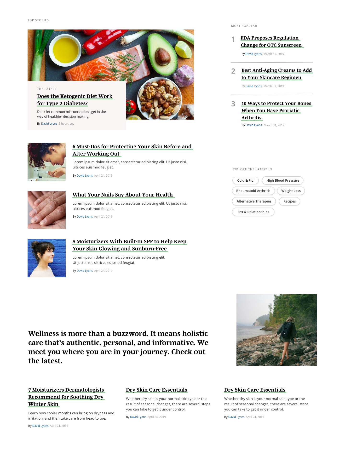
The final high-fidelity wireframes include a hero section that can either be curated or autopopulated by recency, followed by two sections to showcase the top content categories on the site, Health Topics and Wellness. We also wanted to spotlight the engagement tools on the site, including the symptom checker, assessments, and Tippi (more on this down the page).
The final wireframes were built upon for visual designs.
Assessments Redesign
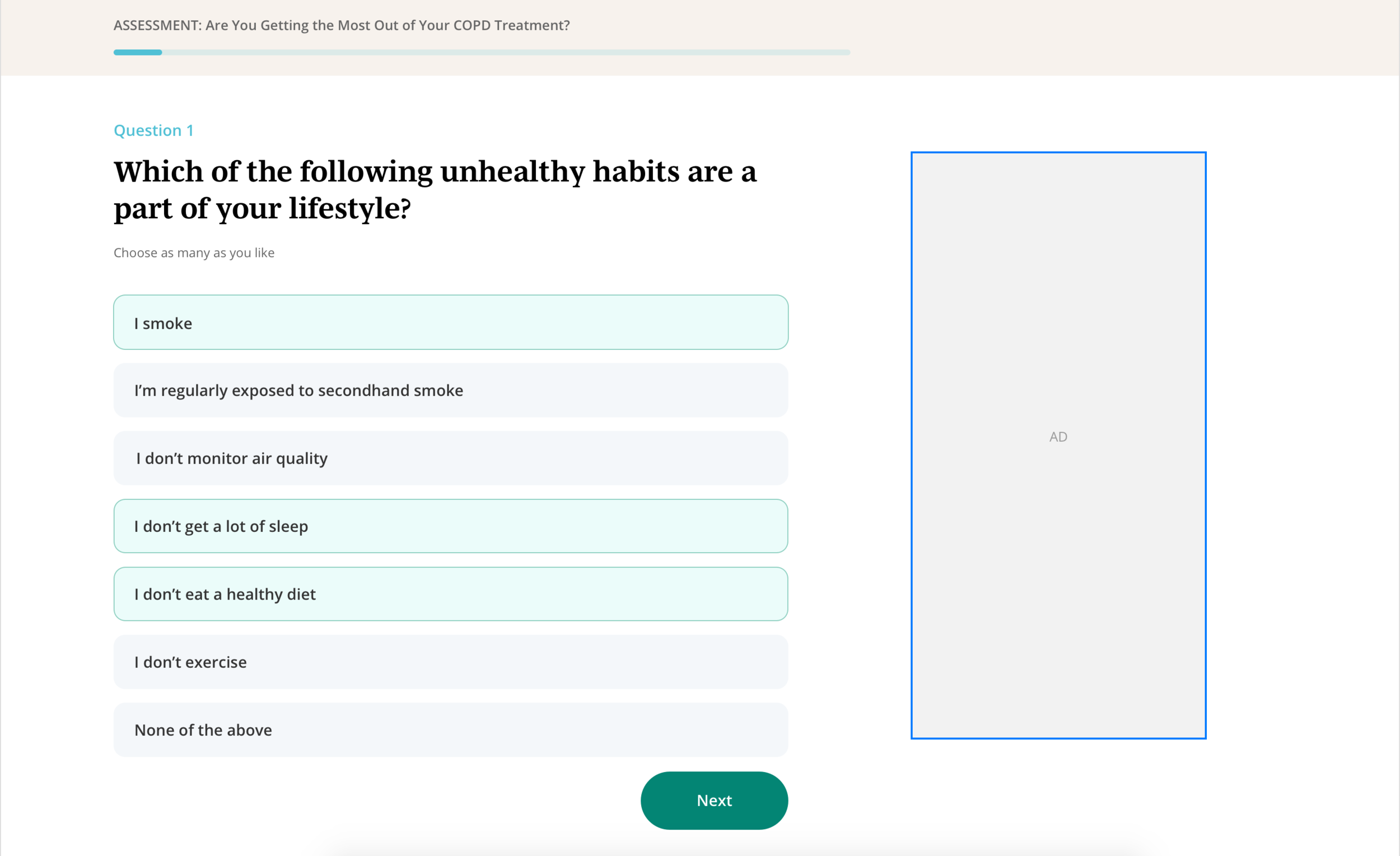
We needed to update the look and functionality of the assessments tool on the site, a product on the site that generates medically-based results for users to take to their next doctor’s appointment. With the redesign, I sought to create an interaction experience that was engaging, informative, and fun to use.
Assessments can contain a short article as well as various types of questions. To trigger the assessment, users can select Start Assessment on the header, which jumps them down to the first question, or scroll through the article content and onto the first question. The assessment shows one question at a time, but users can scroll back up to change an answer. I also considered various states, including: single-select answers, multi-select answers, questions and answers with images, and how results are presented and packaged for download or email.

Tippi Redesign
Tippi is an in-house product where community members can read and share tips with other patients, caregivers, and healthcare providers about ways to cope with ongoing conditions like multiple sclerosis, endometriosis, or even living under the Covid-19 pandemic.
Even though Tippi had been live for over a year, it had never gone through an extensive user research process in the initial rush to launch an MVP. To prepare to conduct user interviews, I created a proto-user journey, below, to identify my assumptions of how patients might feel and what they might look for along their journey. This helped me identify the gaps in my understanding of users’ goals and mental frameworks.

Proto-user journey that I prepared before user testing.
Next, I conducted a series of 13 online user interviews with the current Tippi experience to understand how patient-consumers manage their conditions now, the role of online health research in their lives vs. traditional sources like their primary care physician, and whether they found Tippi to be useful, usable, and desirable.
Selections from a user testing insights deck that I created appear below.

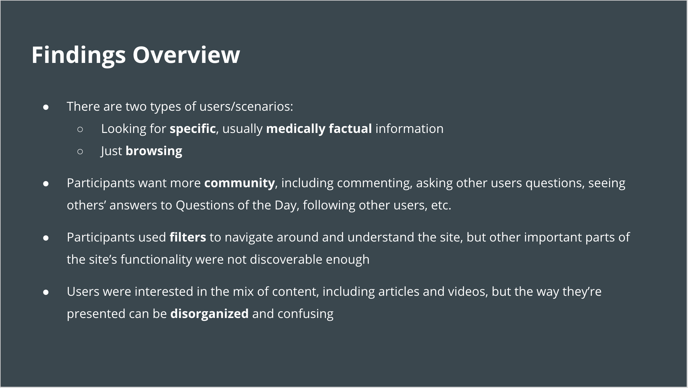


Key findings included:
There were two types of users: ones who wanted more medically-vetted, credible information, and others who enjoyed browsing the experience as a social media feed.
Users were looking for more ways to connect to the community, including being able to comment, request a tip, and follow topics and other community members.
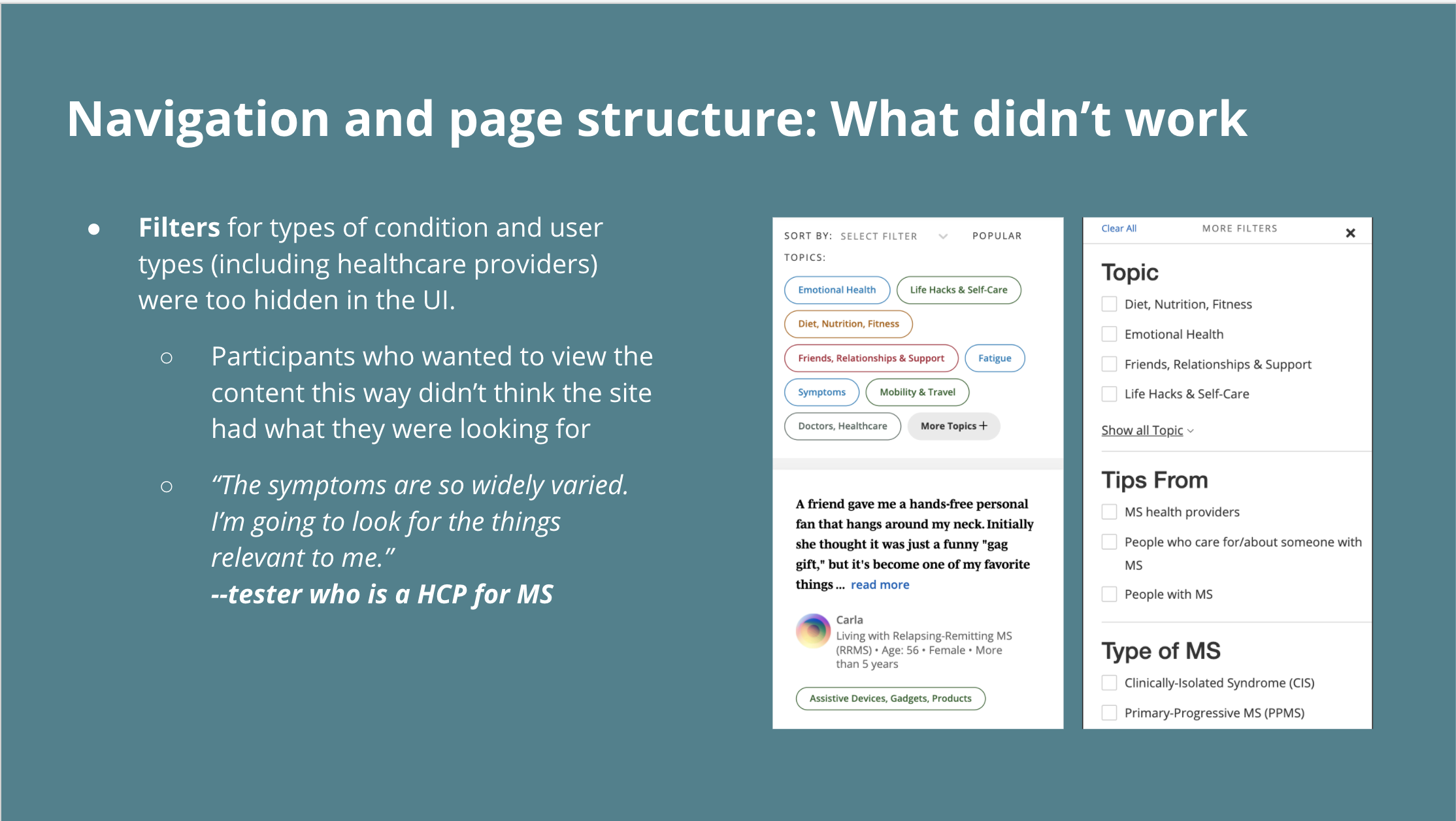
To navigate the site, users filtered easily by topics, but the other filters (by demographics) weren’t discoverable enough. They also were confused by the scope of the site.
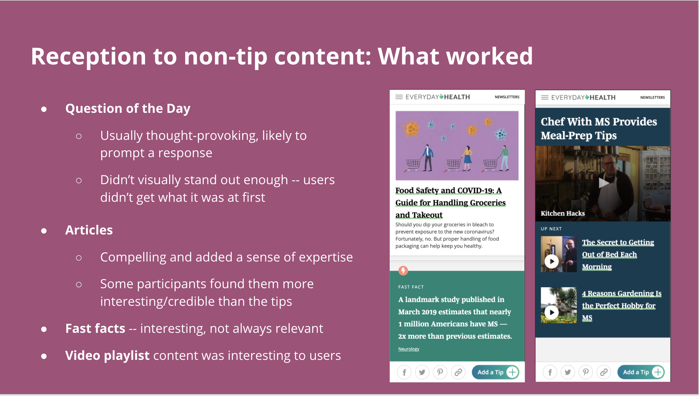
Reactions to non-tip content, including videos, articles, and TippiTV were mixed. That they were scattered throughout the feed felt confusing and disorganized.
Following user testing, I used the insights from testing to overhaul the current experience, with the following product goals in mind: 1) Encourage organic tip submission, 2) Increase engagement, and 3) Increase retention.
The final wireframes address both the user findings and the business/product goals by separating out different types of content into different sections, building community features like threads for commenting and asking questions, surfacing more navigational filters, and highlighting user profiles, giving special designations to healthcare providers to add credibility and expertise.